Making a website suitable for mobile is a mix of technical optimizations and editorial improvements. Here is a checklist of the 10 actions to take to make your website mobile-friendly, in other words, to facilitate navigation on mobile phones and digital tablets.
When you visit your mobile website, you realize that this mobile interface is not suitable: display problems, non-intuitive site, inappropriate text. It’s just that your template (theme) is not responsive! In other words, it is not suitable to be viewed from a tablet or smartphone but only on the web. With our few simple tips, you will optimize your site.
Rest assured, the technique can be very simple if your site has a CMS ( Content Management System ) type WordPress. Editorial, for its part, depends above all on your marketing vision and your writing skills. The following tips were not done by a developer but by “simple” web editors who have mastered WordPress.
Here are 10 tips to make a website suitable for mobile:
1. Choose a theme suitable for mobile
When you buy a theme (or template) to customize your website mockup, check that it is responsive; that is to say, the content adapts correctly to the different screens’ sizes. To check this, display the theme’s demo site on your desktop browser, then reduce the size of the window with the mouse: if the content “follows”, in other words, if the elements (menu, texts, photos, etc. .) adapt to remain readable, the theme is responsive.
The theme should also be mobile-friendly, meaning that the navigation is designed to be used with big fingers on a small screen. The menus must remain usable; the links must be sufficiently spaced, etc. To verify this, copy and paste the website URL into Google’s mobile optimization test. The answer is quickly displayed on the screen without the need to create an account.
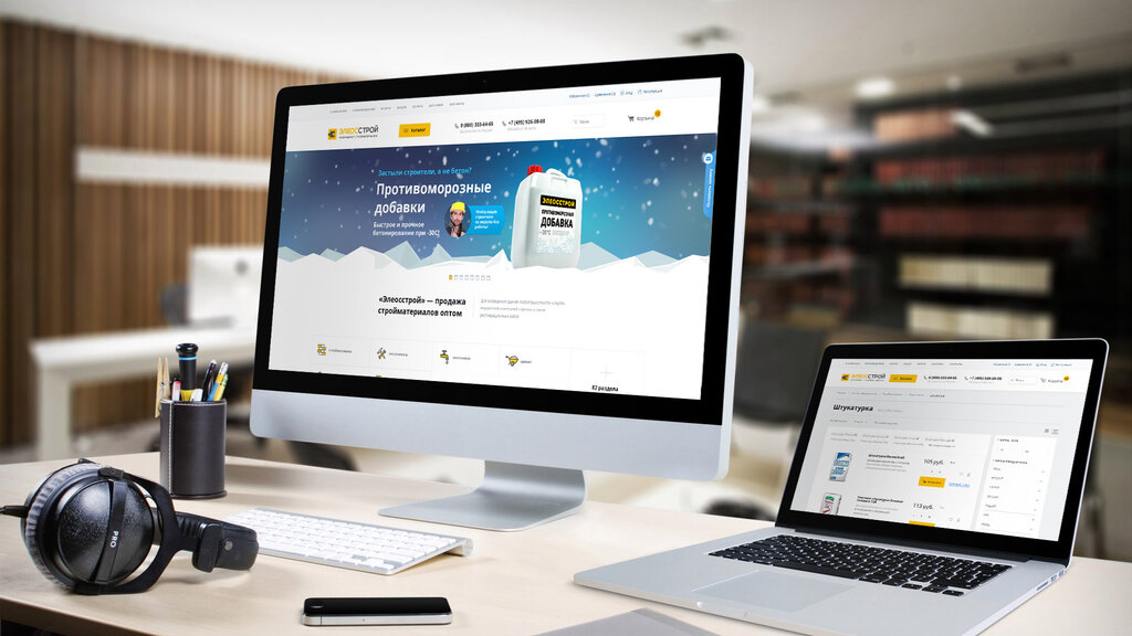
2. Lighten the images
If they are too big and too heavy, the images can slow down the pages’ downloading and scare away mobile users. Images take longer to display on mobile with a wireless connection, whereas they display correctly on a desktop with a wired connection.
WordPress plugins allow you to automatically lighten all the images on your site, like Imagify. You can also format your images before uploading them to your site using free tools like Photo Reducer (a small piece of software to install on your computer) or Tinyjpg (click and drag online).
Check that your images remain readable on a small mobile screen. Indeed, some themes greatly reduce the size of the images, while others crop them by automatically zooming in on the center or the top of the image. The result is sometimes incomprehensible.
3. Speed up page downloads
If the pages are displayed too slowly, the mobile user is leaking! To see where you are in terms of speed, Google offers a free tool that allows you to test your site’s loading speed on mobile: Test My Site. The tool calculates in seconds the display time of a given URL on mobile and gives (very) technical advice to improve it.
Caching is a classic optimization to speed up the display of a website. The principle is simple: when a web page is displayed, a lot of data is calculated. This involves recording recurring data to avoid recalculating it during a new display, limiting requests from the server, and displaying the pages more quickly. If you have a WordPress site, install dedicated plugins like WP Rocket (paid) or WP Super Cache (free).
Take the opportunity to clean up your extensions. Some WordPress plugins can indeed slow down your site more than others. To identify which ones are the least time-saving, test them with the P3 extension (Plugin Performance Profiler).
4. Remove pop-ups and advertisements
Pop-ups and advertisements are very restrictive on mobile because these windows that open by themselves, covering the screen, prevent the site from being viewed correctly. Also, they are not always obvious or even impossible to close on mobile.
It should be remembered that Opquast web quality best practices recommend that ‘browsing the site does not cause the opening of pop-up windows’ and that’ window closing mechanisms are immediately available. “
5. Simplify the main menu
Very nice on desktop, mega-menus with or without images or menus with several nested levels can be very difficult to use on mobile. They are collapsed into a “burger” (stacked horizontal bars) that expands when touched in most responsive themes.
Ideally, all the burger entries are displayed at once on the mobile screen without having to scroll. This pushes to reduce the number of menu entries. And therefore to simplify the organization of the pages of its website. Be careful, however, not to simplify your menu too much, as this may increase the depth of the site.
6. Write the texts for the mobile
When we display a web page on mobile, we want to know immediately if it meets our research to decide whether to scroll down or not. It will be easier to read short paragraphs with short sentences, well organized with subheadings, than endless blocks of text … Better to organize the plan of your page by following the inverted pyramid method.
Start by writing a chapô or summary of a few lines displayed in large print at the top of each page, explaining direct interest to the user. Shorten the length of your paragraphs, even if it means splitting them into several parts. Shorten the length of your sentences by avoiding subordinates. Turn enumerations into bulleted lists. Add clear headings.
7. Add buttons and internal links
To facilitate navigation on mobile, you must avoid as much as possible broken links (404 errors) and “dead end” pages, that is to say, which do not offer mobile users a simple way to continue browsing by clicking on a link or a button, without having to go back to the top of the page in the menu.
We have added call-to-action buttons in the agency’s presentation pages, clearly visible on a red background, arranged at regular intervals on the page. These buttons invite the user to visit a related page, download a pdf, return to a landing page (landing page), or contact the agency.
8. Make the phone number clickable
The mobile user has his phone in his hand: you might as well make it easier for him to call you! The company’s phone number must not only be easily accessible on all pages of the mobile site, but it must also be possible to call simply by touching the number.
This requires special coding. If you just write the number visually, it won’t be clickable. It must be coded as follows in html <a href= “tel:+33 5 53 24 82 50 “> +33 5 53 24 82 50 </a> so that it is displayed as follows: +33 5 53 24 82 50
9. Add a Google Map
If Internet users use their phones to go to your website, it is because they are on the move. Maybe they are near your store doing their shopping? Perhaps they have an appointment with you and are looking for the address?
Adding a Google map to your site is therefore very useful for mobile users. Type your address in Google Maps, then click on “Share”, then click on “Embed map”, then customize the window’s size to obtain the HTML code to copy and paste into the HTML of your site.
10. Test the site on several mobile devices
Finally, put yourself in your users’ shoes by trying to navigate your site from different mobile devices (phones, tablets, Android, iPhone, etc.) and with different browsers (Chrome, Safari, Samsung Internet, etc. ). Also, have it tested by relatives, customers, see how they use it, listen to their comments.
Do you want to launch your online business presence? Are you looking for Web Development in Pakistan to upgrade your web design? Count on us to get competing Web Design and Development services.
